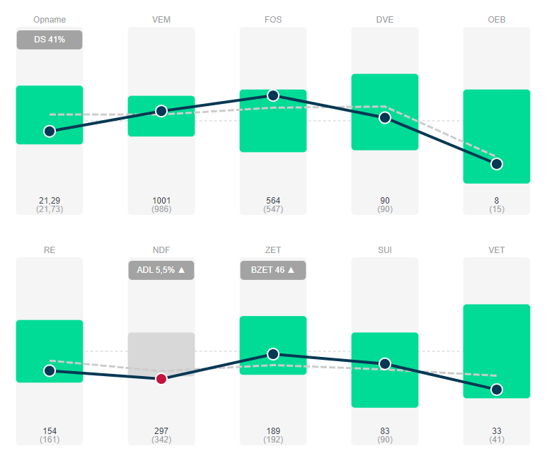
The new Performance Indicators page gives you visual insight into your feed technical and economic performance. Based on a dozen key figures, you can look through your farm and make the necessary adjustments accordingly.
A unique feature is the "colored cloud," which shows a visual benchmarking. This cloud provides a comparison with other Farmdesk users.
In the comparison, we use as measure the feed profit at equal milk price. This key figure is the best indicator of overall techno-economic performance. Assuming an equal milk price eliminates the effect of different milk prices among dairy collectors.
Construction "colored cloud"
Farmdesk continuously processes all data from the various participants. Before making analyses, the data is "cleaned up": unrealistic values in terms of production, feed prices or feed intakes are removed, and measurement points of farmers who do not update feed lists frequently enough are left out of the equation.
The structure of the visual comparison is summarized below (using feed efficiency as an example).
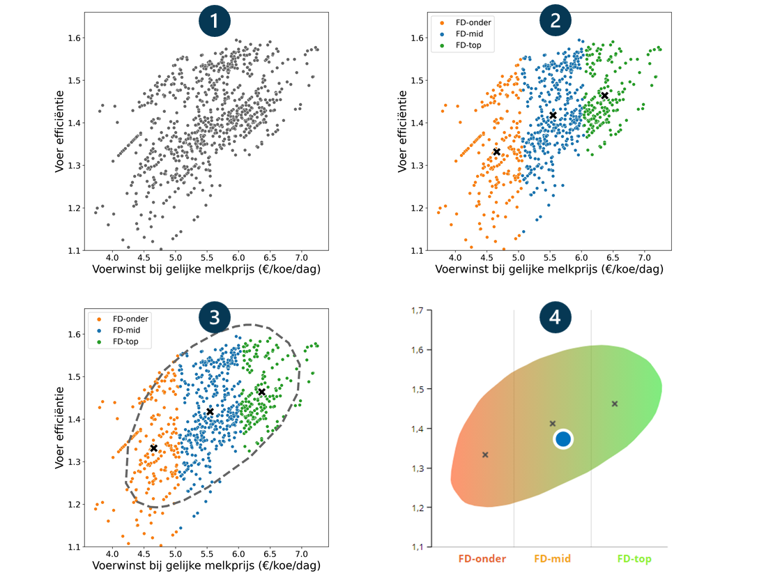
In step 1, the filtered measurement points are plotted in relation to the feed profit at equal milk price (in this example, feed efficiency).
In step 2, all measurement points are divided into 3 groups: FD-bottom (the 25% livestock farmers with the lowest feed gains), FD-mid (25-75%) and FD-top (75-100%). For each group, the average is also calculated, indicated by a cross in the figure.
In step 3, a distribution ("cloud") is calculated based on the density of the measurement points. This cloud, which contains most of the measurement points, clearly shows a trend: on average, higher feed efficiency gives higher feed gains.
In step 4, only the cloud is taken over and colored in. The color changes from red to green: the more to the right, the higher the feed gain, the better. The cloud also shows the average value of your farm (the blue bullet).
Interpretation
The Farmdesk performance indicators allow unambiguous interpretation. The figure below again uses feed efficiency as an example.
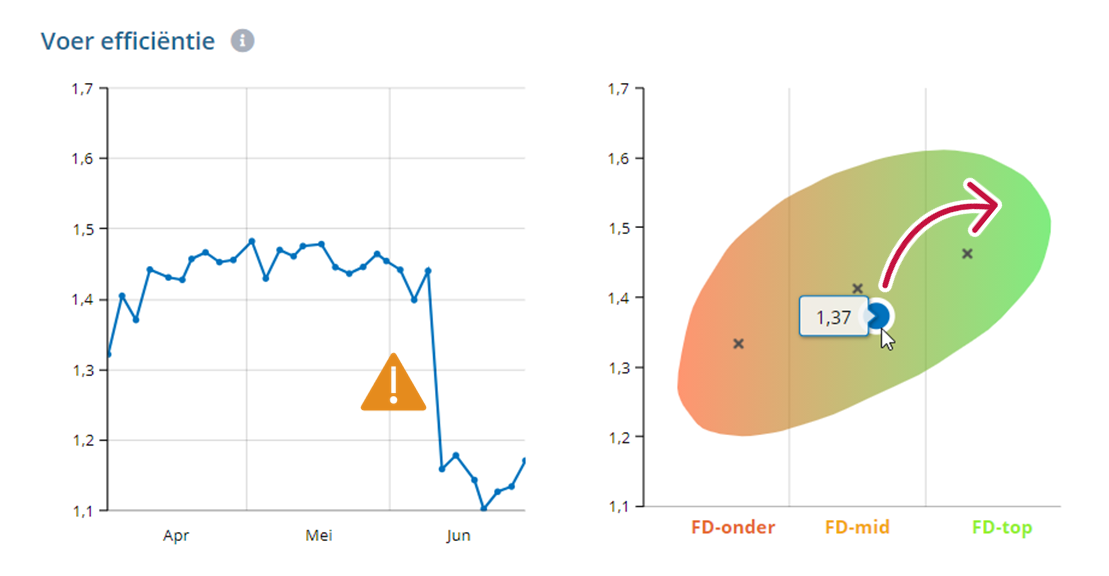
The figure on the left clearly shows how feed efficiency took a serious dip in early June.
The blue measuring point on the figure to the right shows the average feed efficiency of this farmer over the April-June period, with a value of 1.37. Working toward higher feed efficiency (bullet up) automatically drives toward higher feed profits (bullet to the right).